Summary: Latitude vs. X
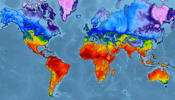
Image provided by Aeris Weather.
For this project, I analyzed the relationship between a city's weather trends and their proximity to the equator. To accomplish this, I first pulled data from the OpenWeatherMap API to assemble a dataset of over 500 cities. After assembling the dataset, I used Matplotlib to create scatter plots and assess the data. I looked at the relationship between the following trends:
- Latitude vs. Max Temperature
- Latitude vs. Humidity
- Latitude vs. Cloudiness
- Latitude vs. Wind Speed
This site provides the source data and the visualizations created as part of the analysis, as well as descriptions of trends and correlations found.